Tuesday 29 March 2016
Music Video First Draft
This is the first draft for my music video, my next task will be to carry out a questionnaire and gather audience feedback on how to improve it.
Sunday 27 March 2016
Clips Being used in my Music Video
This is a video showing all of the clips being used in my music video, they are not synced as this was before editing.
Friday 25 March 2016
Filming Location: Bedroom
I filmed the majority of my video in my bedroom as it was a good size and was a suitable location for the character. In the room, I wanted to show how the character was depressed and how he felt as though he was trapped in there which we portrayed through the character smoking and trying to get out of the room. I chose for him to be smoking because it gives off the negative connotations of someone smoking due to stress or anxiety.
Thursday 24 March 2016
Filming Location: The Studio
In the video, I am using the studio as an alternate location where the character will be lip syncing as I have seen in other existing music videos. I will be using the black curtain to darken the appearance of the video which will suit the style of the video more. As the entire video will be in black and white, I think the black curtain would work best for these scenes because it will be easier to distinguish the different location from the lighter coloured bedroom.
Tuesday 22 March 2016
Bedroom Clip Compilation
Here is a short compilation of some of the clips I am using from my bedroom, I will be filming more to fill in more gaps in the music video. In the final video, these clips will be in slow motion.
Sunday 20 March 2016
Complete Digipak

This is my complete digipak, for the inside right (top left) I used the Neighbourhood's abbreviated name, one they are well known for and the image on the inside left (top right) a photograph I took of a car driving down a street at night time using a slow shutter speed. I thought this would fit well with the rest of the digipak as it was mainly black therefore it matched the house style. I changed the logo on the front cover to a posturized photograph of the artist so the fans know what they look like but so it still fits with the rest of the digipak.
Poster Progress 3

After adding the digipak, album name and release date, I put the band's social media links and hash tag at the bottom of the poster so fans are more aware of their presence online, which will result in them gaining more support and increasing their fan base.
Poster Progress 2

I then added important information that I found are essential for posters during my research, this included the band name, the release date of the album and a photo of the cover of the digipak, these all promote the album the artist will be selling.
Poster Progress 1

I began creating my poster by making the canvas size as half a side of a4 paper so it would fit into a magazine, I then changed the background of it to black so it would fit in with my other products. I then added a picture from the music video of the singer sitting in this bedroom staring into space, this promotes the music video by showing the fans what features in it.
Saturday 19 March 2016
Digipak Progress 9

Digipak Progress 8

Digipak Progress 7

Digipak Progress 6

This is the final cover for my digipak, I have followed the simple layout of my style models. I did this to keep the house style close to what the band already has by using only black and white throughout the entire digipak, this also suits the video as it will be in black and white as well to continue the theme. Also, I have made some changes since the last post, I have changed the font of "WIPED OUT!" so it is more bold as it is the name of the album and must stand out. As well as this I have made everything you can see smaller so it would fit onto the template of the digipak properly, this ensures nothing is cut off from the edges when printed.
Digipak Progress 5

Friday 18 March 2016
Digipak Progress 4

Digipak Progress 3

Digipak Progress 2
 After choosing the font, I began creating the cover. I have chosen to do a similar cover to an album by The Neighbourhood because it follows the house style that I am aiming for. I want to follow the idea of a logo in the centre of the cover but I will create my own logo and use 'Wiped Out' as a style model.
 Copyright Details

These are the copyright details for the song I am using for my music video, it means that I have permission to use the song as long as there are adverts on the video, the money made from the adverts will go to Colombia Records. The video will be blocked in Germany.
Tuesday 15 March 2016
Digipak Progress 1

Digipak Analysis 2 - "Whatever People Say I Am, That's What I'm Not"
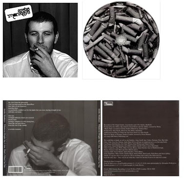
Front
Like the other digipak I analysed, this is all in black and white which again fits with the style of the the artist. I have noticed that this tends to be used for British alternative rock bands who try to portray a working class lifestyle. The man on the front looks very working class and the fact that he is smoking gives off more of these connotations. Also, the name of the album "Whatever People Say I Am, That's What I'm Not" is a quotation taken from the character Arthur Seaton in the working class film "Saturday Night and Sunday Morning" which adds to the image the Arctic Monkeys are trying to create for themselves.
Back
Another thing I have found in common with the two digipaks is that the back has the list of songs included on the disk, this seems like an essential feature to have on the back of my digipak so whoever is looking at it can see what songs are used on the album. There are other things included on the back which all digipaks need such as a bar code and the copyright details, these legally need to be on it in order for it to be sold in shops. The photo on the back is similar to the front cover except the man has his head in his hand, this is like the digipak for the 1975 becuase they have used the same sort of picture but just a variation of it.
Inside
The disk follows the style of the cover and back of the digipak because it is made up of cigarettes, this links with the man smoking. The disk could be representing an ashtray and it is trying to get across how much the man has been smoking by only having photos of used cigarettes, this could reflect on the man's character or personality. The page inside the digipak contains the licencing information and is printed small because it isn't something that many people really need to know.
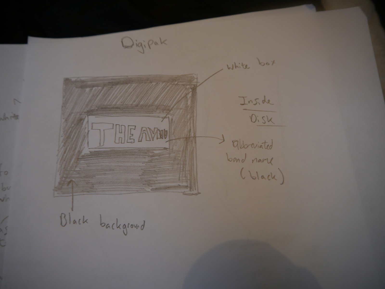
Digipak Style Model
This is the cover of the album that I am using as my style model, as you can see I have used a similar design by using the silhouettes on a white circle but I have created my own version of this.
Digipak Analysis 1 - "The 1975"
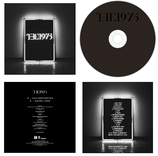
Front
The front cover follows a simple style as it is just a photo of a lit up box with "The 1975" inside of it. This box turned into the band's logo and they have used it on the cover of their newest album but just in colour, this is because it is a recognisable symbol from the band and it is an easy way for the fans to identify them, they also use these boxes at their shows which spreads the awareness and significance of them across their fan base. The cover as well as the rest of the digipak is in black and white because this is how the band represents themselves in person, they mainly wear black clothes and their music videos for this album are all in black and white. It is important to keep the artist's image in mind when making products for them to promote their look and to make sure it is appropriate for their music.
Back
The back of the album is the same as the front cover except inside the box it shows the songs on the album instead of the band's name. Again, this is to advertise this as part of their logo as it is a marketable symbol from the band. The creator of this has included the names of the songs on the back to tell anyone who is looking at the digipak what to expect when listening to the music. In both the front cover and the back, the lighting is in the middle of the photo which draws more attention to the subject of it, in this case, the list of songs. As well as this, the darkness of the edges creates a border and again, focuses people's eyes into the centre more.
Inside
The inside of the digipak is mainly black, the disk is dark with the band's name on it in black and the other part of the inside has a list of credits for the album including the artists and producers, it also has information on the record label. This is a good thing to include in a digipak because it introduces the band and the team behind the album to their audience, especially since this was their first album.
Studio Clip Compliation
Here is a small compilation of clips which have been edited over the top of the song, although this is a rough edit of clips, these will be the main lip syncing parts to the video which I will use together with the bedroom scenes.
Music Video Pitch
Story
The music video will be based on a man who has slowly became depressed over time, he feels like he is trapped in his room and can't get out, his room can also be seen as his mind as he is lost in himself. Throughout the video he will be seen smoking and trying to get out of his room to break free from the depression.
Genre
Alternative rock.
Primary Target Audience
14- 21 year olds interested in the band or similar bands.
Secondary Target Audience
Anyone between 22 and 30 as I think people of this age will still like the music whereas I don't think anyone in their late 30's or above would.
Content
The video will show the man stuck in his room trying to get out, he will try to escape but he is unsuccessful. He will smoke throughout the video to portray how stressed he is, smoking has the negative connotations since it is addictive and a lot of people do it as a way of finding relief.
The video will be in black and white and will have a high contrast, this is so there is more emphasis on the black as it is a colour that represents sadness, the character will be wearing all black throughout the video to reflect his mood.
There will also be parts of him lip syncing, these will be filmed in a studio with a black background to yet again reflect his emotions, the use of the colour black is important because I want these parts of the video to appear as dark as possible.
Locations
Studio
Bathroom
Bedroom
Music Video Analysis 3 - Catfish and the Bottlemen - Soundcheck

In the beginning, the mise en scene of the music video is dark, it shows a ruined room with all of the band members in with low lighting coming from, the roof. This low angle shot introduces the band to the viewers and sets the scene for the rest of the video.

When the music kicks in, the room brightens up and the singer starts to lip sync the first words of the song, here he is shown doing this because his vocals are the most dominant sound and therefore it is most effective to show this through the visuals. The close up shot places emphasis on the singer's mouth.

There are a number of different kinds of shots in the music video, one being this medium shot from the side of the band. It is important to have a range of shot types when making a music video because it gives it more variation and keeps the audience interested by seeing new things.

There are also short clips of close ups of the instruments at times where the guitar is playing a riff for example, they have did this for the more notable parts of the instrumental because they will link together better.

This low angle shot from the back of the band is at the bridge of the song, the room goes dark again with a bright white light facing the band. The use of the dark relates to the lyrics in the video as this is where the lyrics are more sad.

Towards the end of the song the video shows a silhouette of the lead singer lip syncing into a the microphone, this is a very recognisable part because it has been used as the thumbnail for the video on YouTube. It is effective because the high contrast highlights the features on the edge of his face like his mouth for example.
Monday 14 March 2016
Digipak Flat Plans


These are the flat plans I have made for my digipak, as I will begin to create this on Photoshop soon.
Sunday 13 March 2016

Saturday 12 March 2016
Poster Analysis 1
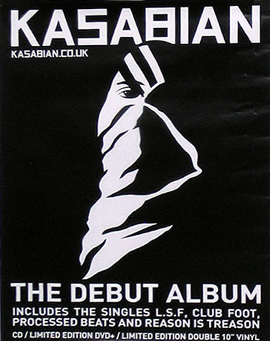
This is a poster for an album by Kasabian, it is completely in black and white which suits the band's look. It is important to keep things like posters similar to the artist's style because they are a form of synergy and are made to promote the band. All of the text is in block capitals which reflects on their sound, the capitals suit rock bands more because they are more rough and angular. The graphic is relatively simple and is the logo for the album, therefore this is significant because people will be able to identify where it is from straight away and it will also promote the album to people who have never listened to it before.
The poster also includes Kasabian's website which is like the home for their band, this is important to include in a poster because people will be able to access their website from looking at their poster, this is where they will sell other music and merchandise so in the end it will result in the band having more sales for their products.
At the bottom of the poster it tells people what the poster is for by having "The Debut Album" and has their most popular singles which feature on the album. They have chosen the most popular songs because there is more chance for people to recognise and like them and therefore go on to but the album.
Poster Analysis 2

This is the poster for "+" by Ed Sheeran, the layout to it is simple as it just has the album cover in the middle with text at the top and bottom. The text at the top tells people the artist's name so the viewers will know who the album belongs to, then they have put the cover of the album in the middle because this is where most people will look on the poster so it is effective to have the main subject in the centre. The cover is orange because the artist is well known for having ginger hair, therefore they have used this as a selling point since it is something many people will recognise him from.
At the bottom of the poster it says what the album is and that it is available now, this gives people all the information they need to go and buy the product, and the fact that it was the U.K. number one album could make it sell even more because people will be able to see that it is popular. It also includes Ed Sheeran's website at the bottom, the website will sell other products by him so this will result in more sales and the artist making more money.
Friday 11 March 2016
Music Video Storyboards


These are the storyboards I have made for my music video, I have talked through each shot and transition I want in my video.
Subscribe to:
Posts (Atom)